Monday, 8 November 2010
Planning: Phase 3
From our previous research into nightclubs we were able to know what to include to make the scene feel like a nightclub.
We need to make a list of props that will be needed for the scene, including a disco ball and coloured filters. We will have to work as a team to make sure that we can rely on each other to produce the props that are needed as one person may be busy when other members of the team are not.
After the props have been bought and have been made to scale with our set, we will be able to start creating the nightclub and placing objects in the scene to make it look and feel like a nightclub through the images we produce.
We are also going to have to discuss how we are going to move the dolls to create realistic dance moves that our audience can relate too, making them laugh.
As there is going to be more than one doll moving at a time because they are all dancing we need to come up with a way to keep our work simple yet effective in what we do as it will be complicated for us to try and pull off complicated movements which could not look as effective as they could if we took our time and focused on certain characters.
Friday, 15 October 2010
Phase 2
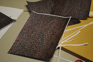
After finding a background which would work, it needed to be edited using Photo shop to create a dark look on the brick work to give the effect that the scene was taking place at night.
Once we had our background, as we had previously decided through researching into nightclubs, we needed to add fliers and posters to the set to stick to the conventions of a typical nightclub.
Jamie was able to create posters using Fireworks software and once they were created asked the rest of the group for approval.
Once all the props were printed and we was ready to film, we had to cut out all of our images ready to stick onto the walls.
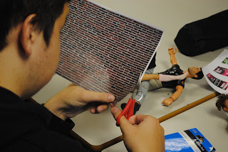
Once the set was completed and the dolls were positioned for the first shot, we placed a lamp from all different angles around the set and took a number of images to see where produced the best lighting for the night scene we was looking at achieving.
The part of the scene which involved the Barbie's was fairly difficult to complete as we had difficulty taking still images without the support holding the Barbie's upright showing. To resolve this we had to place one Barbie in front of one another so that they hid the backs of each other as they walked towards the nightclub.
The males were much easier to maneuver as their feet were flat, whereas the Barbie's were not.
Taking the close up images of the Barbie and Action Men's faces proved to be more difficult than expects due to the light making the images overexposed. To resolve this problem I used a flash on my camera, which made the background dark but also added more detail to the faces of the dolls. Creating a sense of becoming known to the characters involved in the video.
Wednesday, 22 September 2010
Research into Nightclubs
 Through researching several of London's top nightclubs - we have found that the set up and architecture remains fairly consistent. The dancefloor is usually what takes up the greatest amount of space in the middle of the grounds, with a bar normally on the left side and various chairs, tables and lounge areas surrounding the dance floor.
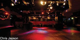

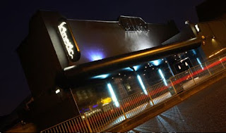
From doing this research into nightclubs and finding out the basics of what needs to be included, we now need to find a way of interpretting these conventions to a smaller scale and creating/ buying the props and mise-en-scene to look both realistic and appropriate for a nightclub atmosphere.
Planning: Phase 2
As a group, the date that we need to start filming has to be decided soon
so that we don't become behind on any filming work that still needs to be completed.
Once we make a prop list, we need to arrange a date and time when the whole group is available to go out and find the items we need, however some of the things we need to have before we start filming need to be made, so we need to organise who is going to make which props and be able to rely on them to have them ready before we start filming.
When we have got all the props for the set up of the next two scenes, we can start putting the set together and experimenting with where we want decorations and the dolls to be placed, working out the best camera angles for the scene etc.
To make sure we get a realistic feel in the set, we are going to research into the exterior and interior of nightclubs so that we have some insight into what needs to be included to make it clear to or audience where the video is taking place.
Thursday, 15 July 2010
Phase 1
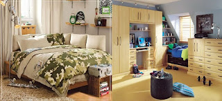
The storyline at the beginning of the music video involves both the main girls and boys of the video getting ready at home before going out. We researched into films we had seen in the past and used traditional routines that happen before going out. So for the girls we decided that an appropriate scene we could include would be looking in the mirror checking themselves out before leaving for the clubs, whereas for the boys, who like to boast with their friends about their looks work out to make sure they are looking good for the night.
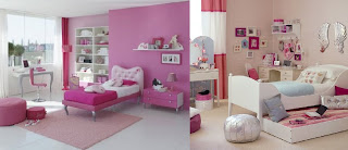
Our group meetings allowed us to gather up props that are normally found in bedrooms/bathrooms and find appropriate colour schemes and posters which would match a conventional teenager or young adults room. The choices we made for our props were chosen to add humor to our set but also add a sence of realism as the posters are quite popular with our audience even if they do not admit to it. We looked online and picked the photos above and below to use as inspiration, aswell as other research from films to make our own set with the clichéd look we wanted to produce.
Tuesday, 13 July 2010
Filming - 13th July


During this meeting we had with our teacher, we came to the conclusion that there was positives and negatives to our second scene. The positives are that we used a new tele-macro lens which gave shots of higher quality. We also experimented with a wide range of different camera movements and compositions which we feel worked well.
The negatives we discussed was that the shiny wrapping paper we used for the wallpaper in this scene was not working too well as it reflected the light too much which made any slight movements more exaggerated. Also another negative was that the posters and the mirror made on the left side of the set were too small and close together which didn't make the set look realistic.
Monday, 12 July 2010
Planning: Phase 1
Now the way we are going to produce the film has been chosen we are going to construct the set for our first opening scenes. We have discussed what we want the video to include to gain the interest of our audience and what would be possible to create, giving the scenes a more realistic and humorous feel in the end result, so that our audience can relate to the scenario.
In order to do this, we are going to discuss all the possible characters that could be included in our video e.g Barbies, Lego, Small toy figures and what will be best for our video in terms of how easy to move around the figures would be and the story we could make up to go along with the chosen music.
We have arranged to have a meeting before filming to see who has any accessories and dolls we could use for the filming and who would be able to buy certain props we need i.e wallpaper.
Together we will be able to produce a whole set which could feature throughout the video for the main parts and for the background in certain scenes to make the video feel more realistic as most music videos have extras throughout. However we don't want to include too many unnecessary features, especially in the nightclub scenes as we feel that we wouldn't be able to produce as much of an effective video if our attention for detail was taken up by a large number of small animation movements instead of focusing mainly on the storyline and making the video looks as humorous as possible and also a scenario people can relate too.
To make the bedroom scenes look more like a stereotypical bedroom we are going to do some research into what are the normal features of any teenage/young adults room and try to replicate this when it comes to filming i.e. posters, wallpaper colours etc.
Summarising Conventions Of Stop-Frame Animation Music Videos
All the videos we looked at used lyrics in order to tell a story to the audience, the subjects of the video - dolls, people, animated characters were used to show this story through the way they were moved in time with the song. Because of this realistic view created onto the animated characters to make them look like real life situations, it added verisimilitude to the videos, which is a feature we want to develop on in our own music video.
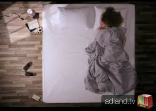
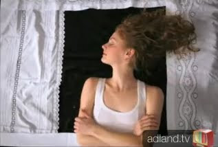
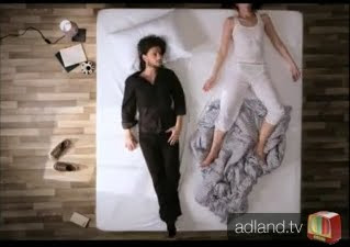
Oren Lavie - Her Morning Elegance Analysis
Thursday, 1 July 2010
Barbie Video From Youtube
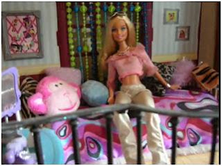
The beginning scenes of this music video create a great mise en scene of a girls typical bedroom with lots of colour and pillows. The establishing shot of the room allows us to see what the room contains and what Barbie is doing. The open view into Barbies room allows the viewer to know that the story is going to be based around this character as she is set in the middle of the shot, showing that she is the focus.
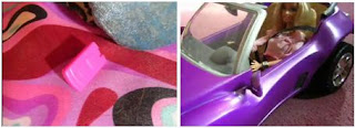
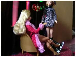
The next scenes show another great example of mise en scene in which the dolls are seen enjoying some time out at a club, we are able to immediately become aware of the setting due to the disco ball in the background and the clothing that has been used on the characters. Small movements are then used to show the Barbie in different backgrounds, like a stereotypical R'n'B video, dressed in different outfits to make her look seductive, as many artists do when promoting their music, the fluent movements of arms and legs in the video show how many frames per second and images must be used in order to create a successful still image animation video which achieves persuading the audience that the dolls are real and moving.

The end shots are used as close ups to show from the end of her body to her face, which show the Barbie as being a figure of desire in which people aspire to be like. The use of different camera angles throughout the video makes it look more professional and effective, and is something that as a group we have decided would be a sensible idea to do ourselves when we create our music video.
Monday, 28 June 2010
Coldplay - Strawberry Swing Analysis

Performer Chris Martin is positioned lying in bed, which is greater in proportion to his action figure sizing. The protagonist, all in stop frame motion, gets out of bed and walks downstairs to eat breakfast – portraying an ordinary modern lifestyle – thus, relating directly to the audience. It is then that the video takes a more original and eccentric slant when the protagonist gulps a fish wholly and creates a speech bubble reading: ‘HELP!’. In this way, the director explicitly appeals to the audience – giving them an active role, a generic convention of stop motion music videos.
As part of the mise-en-scene, the performer is costumed in a generic superhero outfit and flies through the clouds and in to outer space – creating a surreal and humorous image. Accompanied by a giant, cynical squirrel – the director depicts an extraordinary and vividly exciting narrative. The mise-en-scene is enhanced through Chris Martin flying over the seas and to New York, shown through the skyscrapers and lights synonymous with ‘The Big Apple’. The evil giant squirrel then begins to fire arrows at the performer which he deflects with an umbrella – further constructing an image which is surreal and unusual to the audience. In a cynical act, the squirrel then cuts the performer’s cape – allowing him to fall from the skyscrapers, supported by his umbrella acting as a parachute. In this way, the director constructs an impossible and fairytale-like image – reinforcing the surreal theme to the music video.
The video is made fluent and the performer undertakes a series of continuous events, making the continuity of the music video flawless and unrealistically fluent in a humorous fashion. The performer then falls into a lake and is eaten by the Loch Ness monster – a myth synonymous with Scotland. In this way, the director takes the audience on a worldwide historical tour, as superhero Chris Martin attempts to save a lady from being held hostage by the giant squirrel. The audience learn this from the snapshot which appears in the top left of the shot – showing the Queen gradually drowning. This makes the audience anxious and constructs an air of suspense, making the music video more of a narrative in terms of style.
In terms of colour, pastel primary colours are dominant in the music video. The mise-en-scene is drawn on the floor with paints/crayons – so the general emission of the video is sketchy and authentic, applicable to the scene of independent rock in this particular case. Blue is particularly dominant, for mainly the sea and the sky. By using deep shades of blue, an air of tranquillity is conveyed; this coincides with the fluency of the stop-motion, in a surreal sense. This surrealism is reinforced by the use of natural images on a surreal mise-en-scene, making for unusual viewing and fulfilling the gratification of escape.
From viewing this stop animation video we have decided that to create a video that captures our target audience we need to produce a storyline which provides a situation which our audience can relate too but also humour, like the coldplay video, to keep our audience entertained throughout.
Sunday, 27 June 2010
Research into Main Product
Tuesday, 22 June 2010
Questionnaire Graphs
The results we found from this questionnaire data allowed us to have a greater idea of what our audience wanted to see in a music video. This information now means that we are aware of what to include to make our video fit the criteria for our target audience.
The data we gathered showed that our audience would mainly be in their mid-teens so we would have to make sure that the humour included would match their personalities.
We will be making sure that the story within our music video is clear as in the questionnaire it was the most popular answer out of five possibilities.
As the questionnaire continued we made our questions more detailed and targerted towards the type of music video we had in mind to create, so we asked what key aspects were most imporant in animation videos and what features they most liked in films they had previously viewed.
After viewing information we obtained from these questions we understand that we have to make our storyline orginal to keep our audience interested in what is going on and to make the colouring of the video eye catching - like every stereotypical house/electro styled music video.
Secondary Audience Research
We are going to include humour in our music video, which comes from the use of the barbie dolls, who will provide the entertainment gratification and will make our audience feel connected as we will understand the humor that our target group would have. This will in turn make them want to continue watching the film.
Supplying the target audience with a sense of escape from the real world and the things that annoy them throughout the day will allow them to be part of the different life in the story of our music video. The characters in the video may also be similar to people who watch it so they will be able to identify the actions carried out by the characters that they also have, which will enable them to learn more about themselves.
Our music video will also include the methods of Richard Dyer's 'Utopian Solutions'. Our video will provide the audience with a solution to the inadequacy in their lives. We are going to be focusing on two of the three solutions devised in Dyer's method within our music video. The inadequacy of boredom which many people face after sticking to the same daily routine will be replaced by excitement when they watch something different and creative which provides humor and a situation in which you do not know how it will turn out. By our group offering an animation music video we will provide the audience with excitement as animation is an unusual chioce in making music videos.
Sunday, 20 June 2010
Goodwin's Research
- There is frequently reference to notion of looking (screens within screens, telescopes, etc) and particularly voyeuristic treatment of the female body. This is going to be particularly prominent in our video, as Barbie dolls in themselves are synonymous with a materialistic, and voyeuristic character. As well as this, the Action Men are just as voyeuristic to a female audience. We aim to shoot some of the video with one performer half-naked - the epitome of a provocative character.
- There is often intertextual reference (to films, TV programmes, other music videos etc). The brands of Barbie and Action Man are media phenomenons in themselves - producing films, songs and magazines. In this way, our whole production is an intertextual reference - paying homage to the children's toy figures.
Friday, 18 June 2010
Primary Audience Research
Using more than one method of gaining research into our audience will provide us with more detailed overall data and we will be able to take all advantages and disadvantages into consideration when we are in the production phase of our music video.
Quantitative data is useful as it is numerical data and can be put into graphs, charts and percentages which may come in useful for summarising our research into figures.
This type of data is a positive method as you can produce data quickly and in a way which is easy to understand. To gain this data it takes little time and doesn't need much research into it in order to gain the information needed.
However, quantitative data has a negative side as it does not allow the participant to express their views entirely as they are restricted in their answers and means there are limited results so some useful data may not be picked up.
Qualitative data is when descriptive feedback is given by verbal or written responses to open ended questions related to the information you need to receive back from participants. This type of data allows the participants to explain their answers in more detail.
Using this method produces richer data which focuses on allowing the individual to write or say their individual responses and explain this. The researcher can then ask more questions if needed if they believe that gaining more information would be useful for the research. This can however, produce a large amount of written sheets or audio recordings, making the data very hard to group as each interview will vary.
Focus - Group will allow us to ask a small group of participants about their thoughts on our chosen production and to get their ideas on how to make it more attractive to our target audience. This is an advantage for our research as it is cheap and quick to do and we can gain rich amounts of data through the group coming together and thinking of ideas and responses that if a one to one interview had taken place. Through this method we will be able to use our focus group as a check on what was most commonly brought up when asked about issues we needed to address and fix and those we needed to accentuate and target to the audience.
Thursday, 17 June 2010
Target Audience
We are going to use the social grouping in order to target our audience. Gender is a really important part in finding our audience due to the humour our music video will include, which will be more appropriate for a male audience. The genre of our music video is based around ideologies that are stereotypically more appealing to males. This is shown through the original music video where women are objectified and portrayed as inferior to their male counter parts.
We will be challenging this dominant ideology as conveying both genders as equal in terms of status.
Hartley expanded on the social grouping by identifying 7 subjectives that can be used to identify the audience more specifically. We decided that using the subjective of Age would be appropriate as our video needs to target an audience of a certain age group. The age of our audience is important as if we don't correctly identify them then they will not see the humour we have included in our video which we have based our project on. We have decided that a younger age group of around 16-21 would be most effective in capturing our audience due to the genre of music, which is mainly listened to by those who go out clubbing, who the majority of the time, are of a young age. The song itself is more focused onto both younger boys and girls so we will target them by the use of familiar iconography such as Barbie, Ken and Action Men dolls. This will also appeal to an older audience who may find this ironic and amusing.
To successfully create our film we also considered the media grouping of our target audience.
From our primary research we know that our target audience are teenagers who prefer dance music in comparison to R&B.
We chose to create a setting which matched our stereotypical male audience, adding posters of girls from magazines like Zoo and Nuts that boys of that age read. By including cars and popular films in the mise-en-scene of our bedroom scenes it will attract our target audience to feel that the music video is made for their humour.
We have not included targeting our video to those of a specific ethnic background as we feel ethnicity plays no part in the humour our video includes.
The idea of social classification has been used in the media for serveral decades, however the idea of using the ABC1 social grouping idea, is not relevant for our music video as it can appeal to those of any class or status.
Introduction


