Thursday, 15 July 2010

Phase 1

From our planning we looked at all the possibilities we needed to consider and decided that the models which would fit our music video best would be Barbies and Action men as they are the most human like figures and would make it easier for our audience to relate too as they look the same. Generally, at some point in every ones life they have played with the dolls so that also adds humour to the video as the dolls would be acting out scenes that are not normally thought of by young children.


The storyline at the beginning of the music video involves both the main girls and boys of the video getting ready at home before going out. We researched into films we had seen in the past and used traditional routines that happen before going out. So for the girls we decided that an appropriate scene we could include would be looking in the mirror checking themselves out before leaving for the clubs, whereas for the boys, who like to boast with their friends about their looks work out to make sure they are looking good for the night.


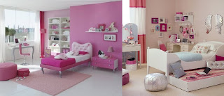
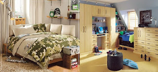
Our group meetings allowed us to gather up props that are normally found in bedrooms/bathrooms and find appropriate colour schemes and posters which would match a conventional teenager or young adults room. The choices we made for our props were chosen to add humor to our set but also add a sence of realism as the posters are quite popular with our audience even if they do not admit to it. We looked online and picked the photos above and below to use as inspiration, aswell as other research from films to make our own set with the clichéd look we wanted to produce.


Tuesday, 13 July 2010

Filming - 13th July

Pictures from filming today


Production Meeting - 15th July


During this meeting we had with our teacher, we came to the conclusion that there was positives and negatives to our second scene. The positives are that we used a new tele-macro lens which gave shots of higher quality. We also experimented with a wide range of different camera movements and compositions which we feel worked well.

The negatives we discussed was that the shiny wrapping paper we used for the wallpaper in this scene was not working too well as it reflected the light too much which made any slight movements more exaggerated. Also another negative was that the posters and the mirror made on the left side of the set were too small and close together which didn't make the set look realistic.

Monday, 12 July 2010

Planning: Phase 1

After researching into animation videos and finding our appropriate target audience we started to work on finding the best filming technique for our work by using the information we had found out from research to show our choices. We experimented with both a video camera and still camera and noted how each produced the clips and images we needed. Whilst looking at advice from previous animation music videos, we decided that using a still camera would be the best choice for our video, as it would save time and we could produce the images we wanted immediately instead of creating video clips and editing the unwanted parts out, which would ultimately consume too much time which could be used elsewhere in our project.

Now the way we are going to produce the film has been chosen we are going to construct the set for our first opening scenes. We have discussed what we want the video to include to gain the interest of our audience and what would be possible to create, giving the scenes a more realistic and humorous feel in the end result, so that our audience can relate to the scenario.
In order to do this, we are going to discuss all the possible characters that could be included in our video e.g Barbies, Lego, Small toy figures and what will be best for our video in terms of how easy to move around the figures would be and the story we could make up to go along with the chosen music.

We have arranged to have a meeting before filming to see who has any accessories and dolls we could use for the filming and who would be able to buy certain props we need i.e wallpaper.
Together we will be able to produce a whole set which could feature throughout the video for the main parts and for the background in certain scenes to make the video feel more realistic as most music videos have extras throughout. However we don't want to include too many unnecessary features, especially in the nightclub scenes as we feel that we wouldn't be able to produce as much of an effective video if our attention for detail was taken up by a large number of small animation movements instead of focusing mainly on the storyline and making the video looks as humorous as possible and also a scenario people can relate too.

To make the bedroom scenes look more like a stereotypical bedroom we are going to do some research into what are the normal features of any teenage/young adults room and try to replicate this when it comes to filming i.e. posters, wallpaper colours etc.

Summarising Conventions Of Stop-Frame Animation Music Videos

From researching into existing stop animation music videos we have found that they all use synchronous editing in order to make the video run smoothly from shot to shot. By using this form of editing it makes the animation look more realistic as the movements are swift from each clip.

All the videos we looked at used lyrics in order to tell a story to the audience, the subjects of the video - dolls, people, animated characters were used to show this story through the way they were moved in time with the song. Because of this realistic view created onto the animated characters to make them look like real life situations, it added verisimilitude to the videos, which is a feature we want to develop on in our own music video.

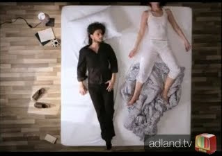
Oren Lavie - Her Morning Elegance Analysis

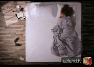
The video begins with an ariel shot of the performer lying on the bed. The bed is used as the mise-en-scene throughout the whole video, thus orientating the viewer and constructing a sense of continuity and stability – relevant to stop motion videos in particular. Through stop motion, the light is seen to drift across the bed, implying a sense of beginning and renewal. The lighting used is chiaroscuro, and constructs a natural setting – as light is seen to be emitted from a single window.

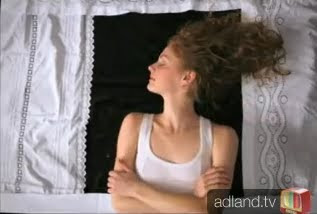
The shot then changes and there is a close-up on the performer’s face lying in bed. This implies closeness and intimacy, a contrast from the first shot – thus making a balanced and rounded opening to the video. All in stop motion, the covers of the bed are pulled off the performer as she begins to walk on pillows down imaginary stairs. In this way, the director constructs a surrealistic dimension to the video, which is identified as a generic convention of stop motion music videos. In a reinforcement of the surreal and slightly random sense to the video, a violin enters from the left of the screen and plays on the performer’s head, enhanced through the resulting diegetic sound. Violins are obviously synonymous with music, therefore the director reminds and orientates the viewer, and the video’s genre of indie rock is accentuated.

A close-up is again used by the director, breaking away from the constant long shot/master shot. This gives the video variety and more realism than before, increasing its validity as a narrative. The theme of progression is conveyed by the director through the use of stop motion. The performer is shown to be walking and the mise-en-scene changes as she walks. In this way, the performer is given control over her surroundings and the methodology of the video is continuous. By using a controlling female performer, the director supports the neo-dominant ideology that the independent rock scene is becoming a more gender equal genre. The video is made slightly humorous later in the video, when the bed is turned into an urban park. This is surreal, as from the long shot, the viewer can see the laminate flooring with pieces of mise-en-scene laid on the floor, such as a hairdryer and books. These pieces of mise-en-scene are synonymous with the bedroom, and moreover offer the video a second meaning. This also breaks the dramatically labelled ‘fourth wall’ – a generic convention of stop motion music videos.

The main location of the bed is used to create a flat window which the performer stands and looks out from. This constructs a romantic image, which coincides with the music – which is of a slow and soft nature. The camera shot remains as a long shot, taken from a high angle. This continuity is particularly prominent in stop motion videos, as it is vital that continuity is kept to make the video authentic and in a more explicit sense: believable. The performer then crawls back into bed and the cover scrunches up around her body, all in a long shot. In this way, the director creates a rounded visual image and portrays the cycle of night and day. This creates a balanced narrative, in the way that the narrative is more flowing and not focused on a particular event.
This video has enabled us to become aware of how many shots are needed in order for our video to look fluent and more proffessional, so that our audience can easily understand what is happeneing in the video through the detailed movements we create in our animation. We need to focus on this aspect of the video in order for our video to be taken seriously and for the hours of work put into the video to show.

Thursday, 1 July 2010

Barbie Video From Youtube

To gain an understanding of how a stop animation video actually took place, we researched into Barbie themed stop motion so that we had an idea of what we would have to do with our own video. We used Youtube to find a good Barbie stop animation video to analyze. http://www.youtube.com/watch?v=Fbopu8KIoWU
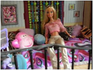


The beginning scenes of this music video create a great mise en scene of a girls typical bedroom with lots of colour and pillows. The establishing shot of the room allows us to see what the room contains and what Barbie is doing. The open view into Barbies room allows the viewer to know that the story is going to be based around this character as she is set in the middle of the shot, showing that she is the focus.
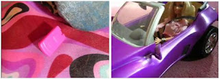


The next scenes show how the story unfolds with the song choice, the shots have been chosen to allow the audience to keep up with what is going on and understand how the character gets from one scene to another. This is an important factor to consider with our music video as we will have to make sure that the audience understands so that they understand the humor behind our story line.
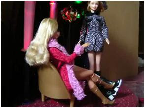


The next scenes show another great example of mise en scene in which the dolls are seen enjoying some time out at a club, we are able to immediately become aware of the setting due to the disco ball in the background and the clothing that has been used on the characters. Small movements are then used to show the Barbie in different backgrounds, like a stereotypical R'n'B video, dressed in different outfits to make her look seductive, as many artists do when promoting their music, the fluent movements of arms and legs in the video show how many frames per second and images must be used in order to create a successful still image animation video which achieves persuading the audience that the dolls are real and moving.
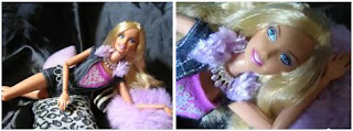


The end shots are used as close ups to show from the end of her body to her face, which show the Barbie as being a figure of desire in which people aspire to be like. The use of different camera angles throughout the video makes it look more professional and effective, and is something that as a group we have decided would be a sensible idea to do ourselves when we create our music video.
After watching the Barbie still animation, I researched the original video to the music that was used to see if there was any link between the two. The original video has been used as inspiration on the Barbie video to show the resemblance and I think that this has shown our group how much planning has to be done in order to create a successful set which sticks to the storyline that has been agreed.

From watching this animation video, we have picked up helpful tips on what to do with our own animation music video and understand that lots of time and effort is going to be needed in order to produce a great looking set which conveys the stereotypical settings that we aim to include and to make sure that it convinces our audience. This can also be done by making our video as fluent in movement as others that have been produced before.