A2 Music Video
Thursday, 31 March 2011
Wednesday, 30 March 2011
Storyboards And Song Choice
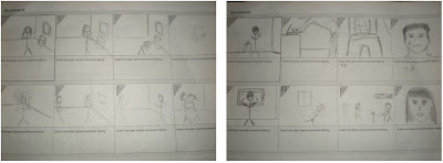
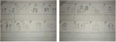
Storyboard:
Lyrics:
Push me
And then just touch me
Till I can get my satisfaction
Satisfaction, satisfaction, satisfaction, satisfaction
Push me
And then just touch me
Till I can get my satisfaction
Satisfaction, satisfaction, satisfaction, satisfaction
Push me
And then just touch me
Till I can get my satisfaction
Push me
And then just touch me
Till I can get my satisfaction
Push me
And then just touch me
Till I can get my satisfaction
Satisfaction, satisfaction, satisfaction, satisfaction, satisfaction
We decided that because our music choice for our media project was from the dance genre and contained repetitive lyrics, based solely for entertainment in the clubbing industry there is no reason to analyse the lyrics to the song as the same verse is used repeatedly to create a good sounding beat to dance too. The lyrics do not illustrate a meaningful message as many other songs are made to do.
Because of this repetitiveness in the song, it made creating a narrative to fit the song difficult. Most videos create a scenario to fit the situation that the song is talking about. As our song did not have one, we decided to use the setting that the song would be stereotypically played in for our music video and then created a narrative story to fit it.
Researching the original video we saw that it also showed a solely entertainment based video which was repetitive with no storyline to it - encapsulating the same message as the song itself.
Wednesday, 5 January 2011
4. How did you use new media technologies in the construction and research, planning and evaluation stages?
Before constructing our animation video we looked at different styled music videos produced by artists of all genres in the music industry. This information that we found allowed us to analyse the different types of animation we could use, how we could develop our ideas and also how we could make ours look distinctive to what has been previously done.
Once we had looked at official videos of artists who could produce animation on a high budget, we decided to use Youtube to seem more animation videos, but from past students who had attempted to do a similar styled video to us. We was able to use this to help us understand how the little details of the setting made the video look automatically more attractive and how to make the most of the resources we had. To gain a more rounded knowledge in what would be needed from us to create a successful video we looked at feedback they received and what was popular with viewers in what they liked and commented on about the video they had watched. By looking and researching what the group who made the video had written in their sidebar gave us an idea of what they felt about creating animation videos and their tips on making it work. These tips included testing both video and photo animation to see what best suited us and then from there deciding on how fluent we wanted the movements to be or if we wanted to go for slower frames per second, making the shots last longer, but looking more jumpy.
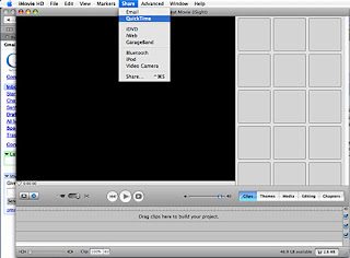
When we had chosen a technique to use for animation and begun taking photos, we needed to upload them into a film and edit the frames per second to make the photos look continuous and film like. To do this we uploaded our videos to a programme on the Apple Macs called iMovie which allowed us to everything we needed. As we were not familiar with iMovie, we looked on Youtube to find tutorials on how to work the basics of the programme.
http://www.youtube.com/watch?v=pL4ZkTfU63U&feature=related
We used the internet to research products similar to our digipak and looked onto internet shopping websites to see how the CDs were advertised to attract their target audience. By looking at how they styled their CDs to fit in with their genre of music and audience we was able to gain an idea of what to include in our own CD cover in order to make it look professional and stand out to our targeted listeners.
In order to create our digipack we had to use a number of programmes as they each had different advantages to using them and allowed us to make our work look the best it could. We used Corel Paint Shop Pro X2, Macromedia Fireworks MX and Adobe Photoshop in order to create our finished digipacks.

Once we had looked at official videos of artists who could produce animation on a high budget, we decided to use Youtube to seem more animation videos, but from past students who had attempted to do a similar styled video to us. We was able to use this to help us understand how the little details of the setting made the video look automatically more attractive and how to make the most of the resources we had. To gain a more rounded knowledge in what would be needed from us to create a successful video we looked at feedback they received and what was popular with viewers in what they liked and commented on about the video they had watched. By looking and researching what the group who made the video had written in their sidebar gave us an idea of what they felt about creating animation videos and their tips on making it work. These tips included testing both video and photo animation to see what best suited us and then from there deciding on how fluent we wanted the movements to be or if we wanted to go for slower frames per second, making the shots last longer, but looking more jumpy.
When we had chosen a technique to use for animation and begun taking photos, we needed to upload them into a film and edit the frames per second to make the photos look continuous and film like. To do this we uploaded our videos to a programme on the Apple Macs called iMovie which allowed us to everything we needed. As we were not familiar with iMovie, we looked on Youtube to find tutorials on how to work the basics of the programme.

http://www.youtube.com/watch?v=pL4ZkTfU63U&feature=related
We used the internet to research products similar to our digipak and looked onto internet shopping websites to see how the CDs were advertised to attract their target audience. By looking at how they styled their CDs to fit in with their genre of music and audience we was able to gain an idea of what to include in our own CD cover in order to make it look professional and stand out to our targeted listeners.
In order to create our digipack we had to use a number of programmes as they each had different advantages to using them and allowed us to make our work look the best it could. We used Corel Paint Shop Pro X2, Macromedia Fireworks MX and Adobe Photoshop in order to create our finished digipacks.

Evaulation 4
View more presentations from Frankiedee.
3. What have you learned from your audience feedback?
To gather our audience feedback we completed a screening and also used online sites to post our work to gain the views of others. As each method contained pro's and con's we felt that using both would provide us with more data that was both qualitative and quantitate.
Feedback for film:
- Evaluation Screening:
Using the screening method to get information was extremely useful as it allowed us to see first hand what people thought of our work and meant that we were able to ask questions that would give us a better understanding of what the audience thought about the video. However, this was a complicated method as it meant that we would have to arrange times when the whole group was able to attend and organize a room that could be used for the screening to take place in. The method was time consuming and meant that the information we gathered was from a smaller range of people.
Feedback:

'That’s actually quite cool!'
'It's really good, well done'
'This is funny!'
'This is actually really really good you must of had s*** loads of patience.'
'That’s f***ing AWESOME!'
'F*** me, that’s sick! Reminds me of the ‘circle circle dot dot’ video.'

'LOL this is jokes! :) Well done'
'Great Video, the outcome quality depends on how you render it, I have my Sony Vegas setup for 720p HD and thats good enough and at a level where it doesn`t take people too long to load like 1080p.
What software did you use to edit? Thats where the quality issue lies, depends on how you set up your software.
Great video, shouldnt be hard to get better quality.'
'Cool video you uploaded :D
Hows it goin, I was just checking out your vids and I thought they were great.
You have a unique talent about you and I think you'd be able to get a lot more subscribers!'
Using social networking sites was a quick and easy way to gain feedback from our target audience and didn't take up much time. However, as the information was taking using a social networking site, the sample that the information was taken from was from a certain circle of friends who got sent or saw the video posted online. This produces a risk of the feedback we got from the sample being bias.
Feedback for film:
- Evaluation Screening:
Evaluation Presentation
View more presentations from Frankiedee.
Using the screening method to get information was extremely useful as it allowed us to see first hand what people thought of our work and meant that we were able to ask questions that would give us a better understanding of what the audience thought about the video. However, this was a complicated method as it meant that we would have to arrange times when the whole group was able to attend and organize a room that could be used for the screening to take place in. The method was time consuming and meant that the information we gathered was from a smaller range of people.
Feedback:

'That’s actually quite cool!'
'It's really good, well done'
'This is funny!'
'This is actually really really good you must of had s*** loads of patience.'
'That’s f***ing AWESOME!'
'F*** me, that’s sick! Reminds me of the ‘circle circle dot dot’ video.'

'LOL this is jokes! :) Well done'
'Great Video, the outcome quality depends on how you render it, I have my Sony Vegas setup for 720p HD and thats good enough and at a level where it doesn`t take people too long to load like 1080p.
What software did you use to edit? Thats where the quality issue lies, depends on how you set up your software.
Great video, shouldnt be hard to get better quality.'
'Cool video you uploaded :D
Hows it goin, I was just checking out your vids and I thought they were great.
You have a unique talent about you and I think you'd be able to get a lot more subscribers!'
Using social networking sites was a quick and easy way to gain feedback from our target audience and didn't take up much time. However, as the information was taking using a social networking site, the sample that the information was taken from was from a certain circle of friends who got sent or saw the video posted online. This produces a risk of the feedback we got from the sample being bias.
2. How effective is the combination of your main product and ancillary texts?
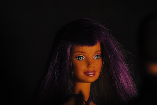
The track we decided to use for our music video is from the dance/techno genre of music and so we decided that for our music video we would keep our video simple along the lines of what you would relate dance music too – a club. We made the Barbie dolls we were using look like they were dressed to go out for the night, with one of the dolls having silver looking trousers and multi coloured hair, showing she has a creative persona. As we were making an animation video and we used dolls, changing the makeup to match the representation of a nightclub we wanted was impossible, however their clothes worked well and as they have bright coloured lipstick on the dolls the vibrant dance look was still noticeable in the video.
For our digipak and adverts we came to the decision that we would use a font that would be easy to connect with dance music and the clubbing atmosphere that comes with it. For both the digipak and magazine advertisement we kept the same fonts for the band and name of the album to keep the continuity throughout our work. This makes it easy for our audience to associate them both media texts together.
We decided that the colouring of the advertisements would also be important as it would represent the CD so that once people had become familiar with the magazine poster they would instantly be able to spot the CD due to the same types of colouring being used. As our genre of music is dance, we decided that bright, bold colours would work best for giving the vibe of a new exciting sound.
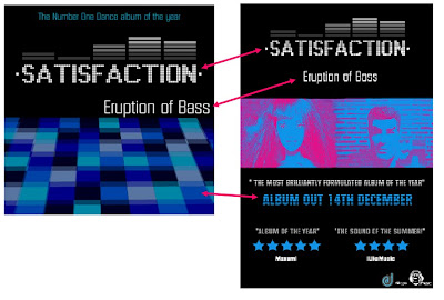
The above image shows how we kept the continunity in both ancillary products by using the same font 'Display' for the titles so that the audience could relate the two.
We also stuck to a specific colour scheme in order to show the poster and the CD covers connection to one another. The use of colours used portray what types of colours are popular for lighting in nightclubs and so represent our style of genre perfectly.
We have made an effective link between our main product and the advert by including images of the dolls in the new music video. This allows the viewers to know what the song is and what to expect from the CD if they have seen the video or if they know the song but not the video, they will know what to expect due to the image on the advertisement.

For our digipak and adverts we came to the decision that we would use a font that would be easy to connect with dance music and the clubbing atmosphere that comes with it. For both the digipak and magazine advertisement we kept the same fonts for the band and name of the album to keep the continuity throughout our work. This makes it easy for our audience to associate them both media texts together.
We decided that the colouring of the advertisements would also be important as it would represent the CD so that once people had become familiar with the magazine poster they would instantly be able to spot the CD due to the same types of colouring being used. As our genre of music is dance, we decided that bright, bold colours would work best for giving the vibe of a new exciting sound.

The above image shows how we kept the continunity in both ancillary products by using the same font 'Display' for the titles so that the audience could relate the two.
We also stuck to a specific colour scheme in order to show the poster and the CD covers connection to one another. The use of colours used portray what types of colours are popular for lighting in nightclubs and so represent our style of genre perfectly.
We have made an effective link between our main product and the advert by including images of the dolls in the new music video. This allows the viewers to know what the song is and what to expect from the CD if they have seen the video or if they know the song but not the video, they will know what to expect due to the image on the advertisement.
1. In what ways does your media product use, develop or challenge forms, conventions of real media products?
As we researched a variety of music videos, we discovered that the majority of them present the same functions and objectives. They generate maximum interest in the artist as some of the videos had related to the artist themselves in one way or another. Also, some artists have a specific style that they keep throughout their videos which keep the audience entertained. Many of the videos researched signify the genre clearly through the use of mise-en-scene (Location used, props, costumes and makeup), camera shots and angles used.
As a group we decided that we would use the original music conventions in animation videos in a variety of ways. The main way in which we used these conventions was by creating a stop-motion animation video that developed the ideas already put forward by similar animations on Youtube.
For the location, we decided to create a set using 3 pieces of wood which we would decorate according to the scene.
The mise-en-scene for our video was an important feature to include when sticking to dance music video conventions as we wanted to keep the video looking as realistic as possible but instead of using real people, we would use Action Men and Barbie’s. The mise-en-scene was an extremely important part for our video as we had to create a setting that looked both realistic and fitted our genre of music. This proved to be harder in some aspects as we could not find any work online from preious students who had created a nightclub scene using stop animation to do so.
As we wanted to have a brief idea of what nightclub settings looked like in dance music videos we used Youtube in order to research some of the work of producers/artists in dance music industry. We felt that Basshunter would be a good choice of artist to look at because he is a well known mainstream dance artist and his music videos typically take place in nightclub settings.
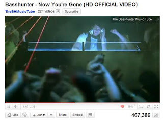
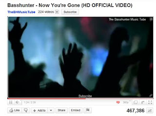
This however allowed us to develop our own ideas into animation video and we created a mise-en-scene that would accentuate the events that would take place there. E.g a black background for the nightclub allowed the coloured filters to show more brightly than if there was a more detailed background.
To develop music conventions we had seen on Youtube videos which had been created for both fun and for media projects we decided that we would have the dolls as part of a story to create the verisimilitude we had seen in existing videos.
Our research into theorists like Vladmir Propp gave us an insight into what a conventional story should contain, even for a music video:
The villain — struggles against the hero.
The dispatcher —character who makes the lack known and sends the hero off.
The (magical) helper — helps the hero in the quest.
The princess or prize — the hero deserves her throughout the story but is unable to marry her because of an unfair evil, usually because of the villain. the hero's journey is often ended when he marries the princess, thereby beating the villain.
Her father — gives the task to the hero, identifies the false hero, marries the hero, often sought for during the narrative. Propp noted that functionally, the princess and the father can not be clearly distinguished.
The donor —prepares the hero or gives the hero some magical object.
The hero or victim/seeker hero — reacts to the donor, weds the princess.
False hero — takes credit for the hero’s actions or tries to marry the princess.
By considering the information by Propp when we create our music video we can stick to the conventional components of a story and produce a music video that our audience find interesting.
Because we had to create a story within the music video we decided that a variety of camera shots and compositions such as tilts, pans and focus pulls would keep the viewer interested. From the use of these camera shots, we managed to edit about 3 seconds the video manually; by having the camera blurred we managed to create a focus pull effect. The rest of the editing was completed on the Mac where we used straight cuts from picture to picture.
As a group we decided that we would use the original music conventions in animation videos in a variety of ways. The main way in which we used these conventions was by creating a stop-motion animation video that developed the ideas already put forward by similar animations on Youtube.
For the location, we decided to create a set using 3 pieces of wood which we would decorate according to the scene.
The mise-en-scene for our video was an important feature to include when sticking to dance music video conventions as we wanted to keep the video looking as realistic as possible but instead of using real people, we would use Action Men and Barbie’s. The mise-en-scene was an extremely important part for our video as we had to create a setting that looked both realistic and fitted our genre of music. This proved to be harder in some aspects as we could not find any work online from preious students who had created a nightclub scene using stop animation to do so.
As we wanted to have a brief idea of what nightclub settings looked like in dance music videos we used Youtube in order to research some of the work of producers/artists in dance music industry. We felt that Basshunter would be a good choice of artist to look at because he is a well known mainstream dance artist and his music videos typically take place in nightclub settings.


This however allowed us to develop our own ideas into animation video and we created a mise-en-scene that would accentuate the events that would take place there. E.g a black background for the nightclub allowed the coloured filters to show more brightly than if there was a more detailed background.
To develop music conventions we had seen on Youtube videos which had been created for both fun and for media projects we decided that we would have the dolls as part of a story to create the verisimilitude we had seen in existing videos.
Our research into theorists like Vladmir Propp gave us an insight into what a conventional story should contain, even for a music video:
The villain — struggles against the hero.
The dispatcher —character who makes the lack known and sends the hero off.
The (magical) helper — helps the hero in the quest.
The princess or prize — the hero deserves her throughout the story but is unable to marry her because of an unfair evil, usually because of the villain. the hero's journey is often ended when he marries the princess, thereby beating the villain.
Her father — gives the task to the hero, identifies the false hero, marries the hero, often sought for during the narrative. Propp noted that functionally, the princess and the father can not be clearly distinguished.
The donor —prepares the hero or gives the hero some magical object.
The hero or victim/seeker hero — reacts to the donor, weds the princess.
False hero — takes credit for the hero’s actions or tries to marry the princess.
By considering the information by Propp when we create our music video we can stick to the conventional components of a story and produce a music video that our audience find interesting.
Because we had to create a story within the music video we decided that a variety of camera shots and compositions such as tilts, pans and focus pulls would keep the viewer interested. From the use of these camera shots, we managed to edit about 3 seconds the video manually; by having the camera blurred we managed to create a focus pull effect. The rest of the editing was completed on the Mac where we used straight cuts from picture to picture.
Comparison of Existing Promotions
View more presentations from Frankiedee
Analysis of final products
View more presentations from Frankiedee.
Subscribe to:
Comments (Atom)

